417 Magazine
417 Magazine Redesign
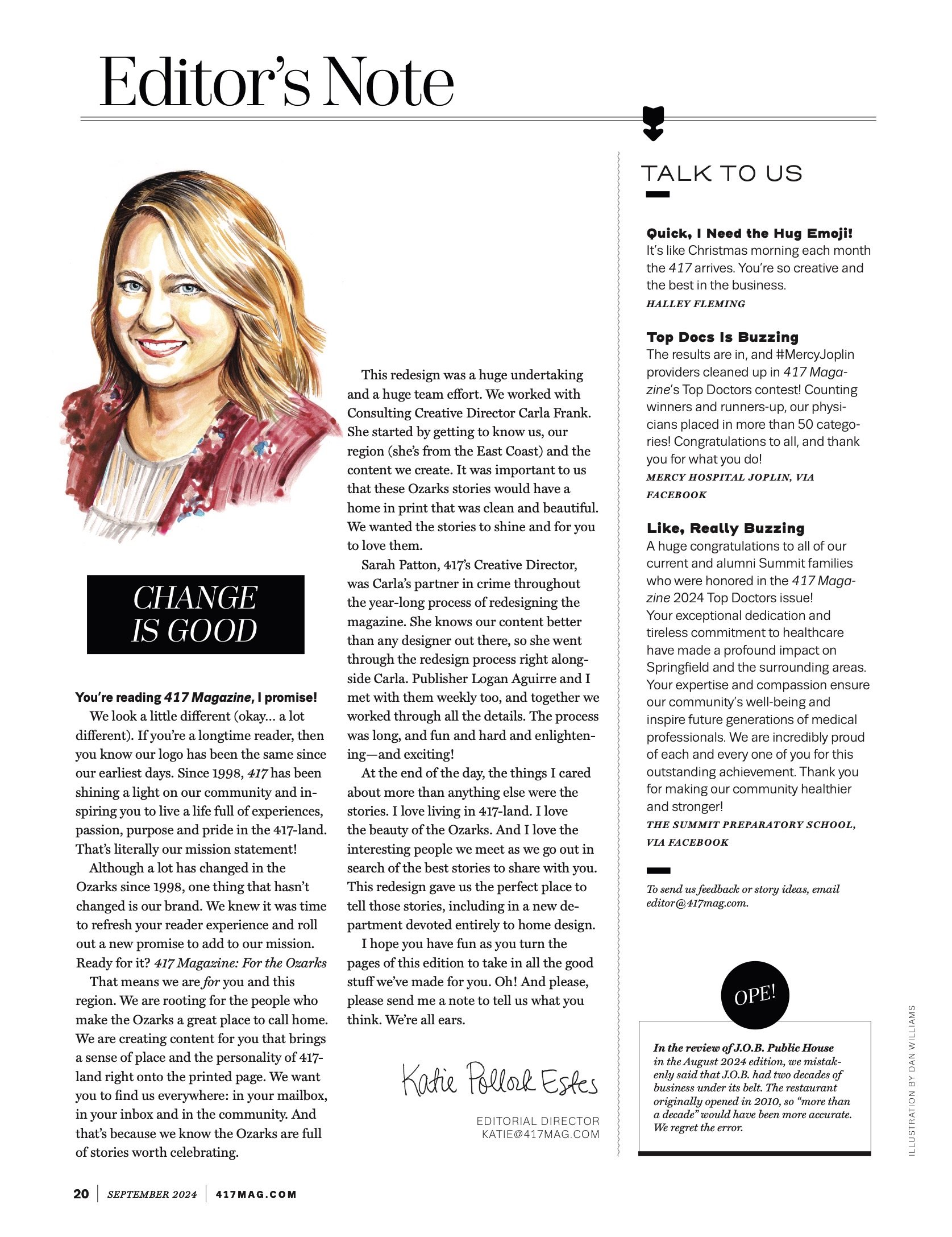
Publishing since 1998, Southwest Missouri’s 417 Magazine has evolved successfully since then. Yet the magazine, which hadn’t been thoughtfully redesigned for many years, remains the heart and soul of the brand.
Publisher Logan Aguirre made a commitment to refresh and elevate the reader experience for her audience and with it, a redefined brand promise. “To redefine, we had to start with "Why do we do this?" The answer is simple: We do it for the Ozarks. And thus, our refreshed brand promise and tagline were born.”
Having a deep fondness for City and Regional magazines we remain truly honored they entrusted us with their redesign.
ASSIGNMENT: To reposition the magazine towards 417’s future brand dreams, enhance the reader experience and elevate the design to appeal more directly to their core audience of women who are highly educated and of upper middle to high-income households.
CHALLENGE: To quickly immerse ourselves into the culture of Southwest Missouri and the company culture as well, in order to successfully re-imagine the magazine. To lead the team into a new era, while partnering with a core in-house team.
EXPERTISE
Strategic Management
Content Development
Discovery
Assessment Report
Logo Design
Brand Redesign
Creative Direction
Editorial Design
Project Management
Cultural Immersion
Cultural Assessment
Skill Assessment
The September 2024 Redesign Issue Debut
We designed two logos for the brand. The top numerical version is the main logo and the written version is reserved for in-house brand reference and exclusive insider events.
Amazing Results
Updated Logo: The logo and general look and feel are more current but also classic. The original 417 logo dated back to 1998. Two logos were designed for use as seen above.
Easier to Read: A more enjoyable reading experience with intentional grid structure and design changes, more white space and room for content to breathe.
Content Renaming and Reordering with Colloquial Language: Even more local love for what makes our region great and insider language that brings a wink. New content flow that feels more natural.
More Home Content: Debut of an entire “At Home” section in each issue of 417 to expand our home and design content.
An overwhelming audience embrace: Loads of heart emojis and praise from subscribers and advertisers
A significant goal of the redesign was to find a way to get both editorial content and ads to shine by reducing visual conflict. A tailored color palette was introduced while keeping the original brand colors of red and black.
“Collaborating with Carla Frank over the past year to redesign our brand has exceeded all our expectations. Thank you, Carla, for dedicating your time, talent, and invaluable guidance to this project. Your process has been transformative, and we are incredibly proud of what we’ve created together!”


